Showing posts with label tutorial. Show all posts

Friday, July 2, 2010

How to make gold paint


There are lots of imitations out there, and some come close, but nothing beats the look of real gold paint. It adds a level of richness to any painting. It shines beautifully. It can be burnished for more shine.

It is possible to buy ready made gold paint from art suppliers. I've never used it, but those who have used store-bought and home made gold paint say there is no comparison. It is not hard to make, either. Just tedious!

This little photo essay explains the basics of making gold paint. Sorry about the bad photography, it is not one of my talents. The how-to is a compressed .JPG file, I do have a larger file on my hard drive.

Tuesday, June 29, 2010

Making egg tempera

When I first became interested in learning to paint with egg tempera I was a bit intimidated by the actual process of making the paint. Here is a simple way to make the tempera that is mixed with powder pigments to make paint:

Mix two parts dry white wine (less sugar) with one part egg yolk. That's it!

This mixture will last several days, keeping in the fridge when not in use. Egg yolk should be pierced with a knife and drained from the yolk sac; don't just mix the whole yolk into the mixture. Optionally run the finished mixture through a strainer to get out any stray yolk sac bits that will result in clumps in your paint.

Here's a simple visual:


There are other recipes for making tempera, but this is what I learned from the Prosopon school of Iconography. Other examples of recipes are just to use egg and water, egg and water with clove oil, or egg and water and vinegar. You decide.

Thursday, June 24, 2010

Continuing the Icon: 2nd highlights

Now the second highlights are painted on Mary's robes using hematite, carmine and lead white. Jesus's robes will be highlighted with shell gold so they will not have any other highlights:


Faces are floated with a translucent gold ochre, carmine and Venetian red mixture, Mary's robes are floated with carmine red and indanthrone blue(a nice Bing cherry color) which really toned down the second highlights. Second highlights were repeated with a lilac color made from carmine, indanthrone blue and lead white. Flesh highlights were supposed to be lead tin yellow but I didn't have this so I used Naples yellow light mixed with lead white:

Tuesday, June 22, 2010

Next step in the icon - highlighting with dark color

Here are flesh areas only with first highlight color (indigo):


Here is first highlight painted on Mary's robes (Venetian red) as well as second highlight started on the flesh areas (Venetian red, carmine, lead white):


The workshop I attended focused on development of more advanced painting techniques and varies from what is taught to beginners. Beginners are taught a specific, easy to follow order of painting: roshkrish, 1st highlights, 1st float, 2nd highlights, 2nd float, 3rd highlights, etc. This week we learned to mix up the order a bit. First and second highlights were painted and then floated, then second and third highlights painted followed by another float. The order was determined by the needs of the painting, using a more intuitive approach rather than a rigid formula. This was both challenging and frustrating because I was so looking forward to the first float (because it mellows out the harsh colors of roshkrish and first highlight) but I had to wait!

Another difference in the more advanced technique was the use of dark colors for the first highlights (more like "darklights", I think). This method seperates dark areas from light and builds volume. I used Venetian red for Mary's robe and indigo blue for the flesh.

Sunday, June 20, 2010

Continuing the Icon: Roshkrish (base color)


In icon painting, paint is laid down from dark to light, from coarse grain to fine. Here is the base color, roshkrish, over the entire icon. The flesh is painted with a mixture called sankir which is a greenish brown. Mary's garments are robes in vermillion and carmine and sleeve/head covering in indigo and indian yellow, and Jesus's robes are minium.

The lines of the drawing were painted with black before the colors were painted and you can see that they still show through. This layer, like pretty much every layer of paint in this technique, is painted transparently. In fact, my colors are almost too opaque. Better to paint too transparently and have to repeat the layer than to paint a single thick layer. In the end this will result in colors that are deeper and more nuanced than solid layers of color.

Tuesday, June 15, 2010

Icon Step 1a - Incising the lines


Next, the lines of the drawing are incised into the gesso. This will provide a guide for general shapes and details. The incised lines will still be visible after the base color is painted, while the colored lines will not. This photo shows the icon board in a raking light so it is possible to see where the lines are incised. Use the smaller side of double-sided stylus or something similarly small, round and metal. Gesso is hard, it takes significant pressure to make the lines. The lines should be pressed into the gesso, not cutting through it (that's why you shouldn't use a sharp blade instead of a stylus).

Thursday, June 10, 2010

Starting a new icon, Step 1


I will be spending all of next week at an icon workshop, painting a Prosopon style icon. For those who have been reading my blog for a while you may remember the icon of St. John the Forerunner I painted at the workshop last year. That was my second icon, but the first in the Prosopon style; it was a beginner level composition. This year's subject is an intermediate level composition with lots of gold (you'll see!). With such a large area of gold it will be EXTREMELY important how well I lay down the bole. I am a little nervous about that. All the gold is supposed to be finished by the time I get to the workshop on Sunday so I'll post pictures up to that point. I won't have internet access during the workshop (and I don't really want it - it will be nice to get away) but I will take lots of pictures and post a step-by-step photo essay when I return.

The 13 by 17 inch icon board is purchased; I just didn't have time to teach myself to make a solid wood board with braces before the class. Eventually I plan to do that; I've only made it as far as cutting wood so far.

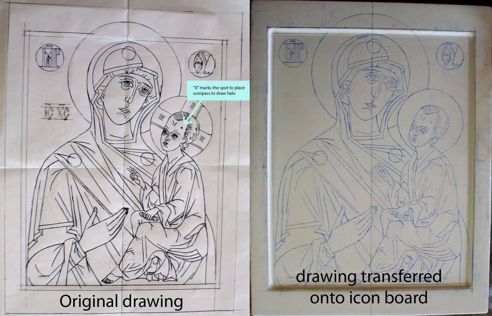
The drawing was made by the instructor, Dmitri Andrejev, following rules of composition about which I am largely ignorant. I wouldn't want to try drawing my own composition - if I were trying to authentically follow the style - without greater knowledge. There are specific ways hands, faces, etc are drawn that have specific meaning.

The drawing is then transferred to the board. First, draw a center line down the middle of the board, just like in the drawing. This will ensure the drawing is not transferred out of alignment. I used transfer paper and a ball point pen to transfer the drawing. Note that there is a little "x" on the face of each figure. This is to mark where to place the compass that is used for drawing the halo.

Thursday, June 26, 2008

A quickly written Needlebook Tutorial

Someone posted a request on h-needlework about how to make a needlebook. I do not have any information on the historical accuracy or use of needlebooks in period (SCA, that is) but the books I make are small and practical. I would love to hear from anyone that has information about needlebooks in period.

I have made several as it is a great small way to try out a pattern, material or technique and get a usable item as a result. They also make great gifts. My first needlebook had many pages and I still use it, but it is a bit bulky. The small roll up design (from an older post, below) is great for tucking into my purse for a carry along project. At least it was until I lost it recently. The little roll up model, some thread, embroidery scissors and a small project (like another needlebook) fit easily into a small ziplock bag.

The design I make now has only two pages which are actually one piece of fabric folded in half and stitched through the middle to the lining. I like to put the same size needle on each page and I have different needlebooks for different types of needles. I keep one book for the needles of my current project. I also make my needlebooks with a little pocket on the inside. The pocket holds my needle threader so it is always in the same place as my needles. It is less easy to forget things when they are all together!

A small needlebook that is big enough to hold most needles need only be two inches by three inches (or 5 by 8 cm) when closed. Or make one as big as you want.


The picture above shows different views of my most recent needlebook. The cover is two pieces of linen sewn together; one has the blackwork and the other is plain red linen that matched the wool I used for the lining. The inside picture shows the pocket attached to the lining with the pages turned to one side. This needlebook is approximately 2.5 by 4 inches.

Needlebook cover

The cover can be a single embroidery folded in half, two embroideries, or half embroidery and the back side plain fabric. Do whatever you want, there are lots of options. The "spine" can be left plain or have a ribbon or cord attached so as tie the book onto a belt.

Lining the needlebook

I line my needlebooks with felted wool. It is thick enough to give the book structure so I do not have to add cardboard or some other stiffening (keeping it simple). For embroidery that will cover the entire surface of the base fabric I use linen congress cloth because it is stiff enough that it can be easily worked without a hoop (fits into my purse) and provides some additional stiffness to the needlebook.

Cut a piece of felted wool the same size as the cover; stitch together. Leave a gap in the stitching where the cords to tie the book together will be placed. It will be much easier to attach the ties by sewing them into the seam if there is a little gap for them to fit into. Or, don't leave a gap and learn this the hard way. Sometimes that is the only way some of us learn.

The pocket is a piece of fabric cut exactly half the size of the lining. Turn under the edges 1/4 inch (or 0.5cm) and stitch to the lining. I place the opening of the pocket towards the center of the book rather than the edge. That way things don't fall out and get lost.

Now cut another piece of felted wool slightly smaller than the finished size of the book (about 1/4 inch or 0.5cm), and stitch it to the lining down the middle to create two pages. Trim any excess as needed. The nice thing about using felted wool for pages is that the edges do not have to be finished in any way because the wool does not fray (again, keeping it simple).

Tying it together

I use ties of the same cord as the edging to tie my books together. Just make sure to think about where the ties will go before stitching the cover to the lining or finishing the edge seam. I like to stitch the ties in before I finish the edges. Sometimes I get excited and forget, then when I realize this I say curse words.

Another method of closing is to use a loop and button. Here is an opportunity to use a pretty button!

Finishing the edges

When the outside and lining are stitched together there is a seam edge which may be left plain or the edge can be finished in various ways. I think a finished edge adds a special touch.

One way to finish the edges is with an embroidered braid. There is an excellent tutorial on the Medieval Silkwork blog here:
http://m-silkwork.blogspot.com/search/label/tutorial
This technique looks nice and has period documentation. I fingerlooped a matching cord to tie the book shut using only two loops.

Another technique is to sew a ready made cord to the seam. I have tried fingerloop braid and kumihimo. I generally use kumihimo because it is so much easier for me to do and my kumihimo looks nicer than my fingerloop braiding.

A third technique is to use tablet woven edging. Maxlu179 has a very nice photo of this type of edging in progress on a pouch he made:
http://maxlu179.livejournal.com/8947.html

I hope this information is helpful to anyone who is interested in making a needlebook. They are really fun!